Myth: White is one of the easiest colors to use. It goes with everything and make the room look brighter.
Those dreamy, creamy all-white rooms that you swoon over in magazines are surprisingly difficult to recreate in your decor. More often than not, instead of a creating a peaceful, heavenly space; white-lovers may create spaces that feel sterile and impersonal.
Why White Decor Color Schemes Fail
There are two main reasons why rooms heavily dependent on white decor don’t work in reality.
1. Practically speaking, white is impractical.
Anyone with dogs, cats, kids, spouses, friends, or the desire to eat spaghetti on the couch is going to have a hard time making this scheme work. Even if you can manage to keep it clean most people feel uncomfortable in a room that doesn’t look like you can live in it.
2. Most people own stuff; stuff that doesn’t look great against white.
The trick to a successful all-white scheme is to keep it WHITE with just a pop or two of color. In reality, are you going to throw out everything you had the room? That gorgeous hand-carved oak bookcase, well, that HAS to come back in once you’ve finished painting the walls. Plus your mom gave you an emerald green vase that you can’t part with. Oh, and there is the black remote caddy that will sit on your light brown coffee table. Now all of sudden your bright white walls are a stark background that makes all of your precious things stick out like a design mistake.
White Done Right
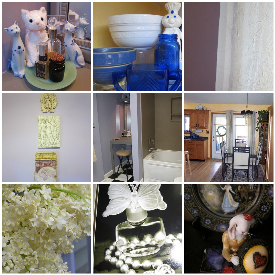
Can you include crisp whites in your room without it coming off as sterile? Small pops of white can add make a room seem cool and fresh, or infuse it with drama, depending on the other elements you use. Here are a few examples of white in my house.

How have you successfully used white in home decorating? Or on the other side of the coin, do you have a white warning story you’d like to share?


Ah, yes.. I remember the days of sharing the entire house with cats…and unfortunately lots of house plants are toxic to our furry friends. :/ I like the sound of your colors too, sisal, creamsicle and lavender.. lovely! 🙂
Fun post Marie! I love these design/decor related posts that you’ve been incorporating into your website, and really enjoyed seeing the photos you added of your home decor. There are only 3 rooms in our house that are painted in colors: (the master bedroom which I managed to coax the hubby into a lovely rust orange; my second studio – which used to be my cat’s room and is currently the color of raspberry ice cream; and our rec-room which is a dark khaki brown color) the rest of the rooms are all off-white. Why? because the hubby likes it that way and I’m very accommodating… plus, the main living space would be a tough one to tackle because the blue/brown living room color scheme shares walls with the green/cherry-stained wood kitchen/dining decor. Those walls are an off white, which helps because it’s not as stark as a bright white. But, one thing that I’ve found which has helped is that we have LOTS of greenery from houseplants; including big ones – some that are about 3 feet tall and almost as wide, others that are in the 2 foot range and still other smaller ones, and one meyer lemon tree that is a foot away from touching the ceiling (from my vantage point on the couch I can count about 24 plants), plus we have lots of pictures and varying height furniture to balance the wall space. Still… when I see those paint cards at the hardware store, I get the itch to paint some more walls… maybe someday! 😉
I love the sound of the rust orange, raspberry ice cream, khaki!
I know what you mean about the transition spaces and adjoining rooms. They are tough! I have a neutral color called sisal in the hallway and on the shared walls in my living room and dining room. The kitchen has a darker shade of that (creamsicle) and the living room has the lavender on the accent walls.
Unfortunately we only have 1 plant. I got tired of trying to keep the cats out of them 🙁
Rob is pretty good about wanting color. We lived in apartments for a while where we weren’t allowed to paint so we went a little crazy when we got our first house. We don’t always see eye-to-eye one the choice so that takes a little negotiation. Of course I steer clear of pinks, but teals and aquas are on his no list. We start by each of us grabbing a bunch of color chips. Usually we have something in common that we can use as our “compromise” color.